How To Optimize UX Research with Beusable
Improper user research can lead to an ineffective design, as well as lots of time and money wasted trying to adjust to the audience’s needs. Here’s how Beusable can help.
Disclaimer: This article is affiliated with Beusable, yet contains my honest opinions

User research is an integral part of the design process, and cannot be skipped.
My background is in marketing, and one of the most difficult aspects of my job was explaining user research to others by using tools like Google Analytics. I didn’t understand half of it myself. The information is clunky and unclear, and how users actually flow through your website can actually be inaccurate if the screens aren’t connected properly.
Fortunately, there is a UX designer-friendly alternative for collecting data on users and how they interact with your website.
What is Beusable?
If you haven’t heard of it before, Beusable is a UX research and data visualization tool that will tell you everything you need to know about your users and how they interact with your website.
Its features include:
- UX Heatmaps
- Reporting Heatmaps
- User Analytics
- Live Heatmap
- Mobile Heatmap
- Path Plots
- Segmenting CTA
- A/B Testing
- Funnels
- Session Reports
- Comparing Referrers
Why are research and data visualization tools like Beusable important to UX design?
Simply put — you get more accurate information from users when they are interacting naturally with your website. While user interviews are useful, it is difficult for users to self-evaluate and truly identify what their needs are. Allow me to introduce you to some important sources of information that tools like Beusable provide:
Scroll Heatmaps
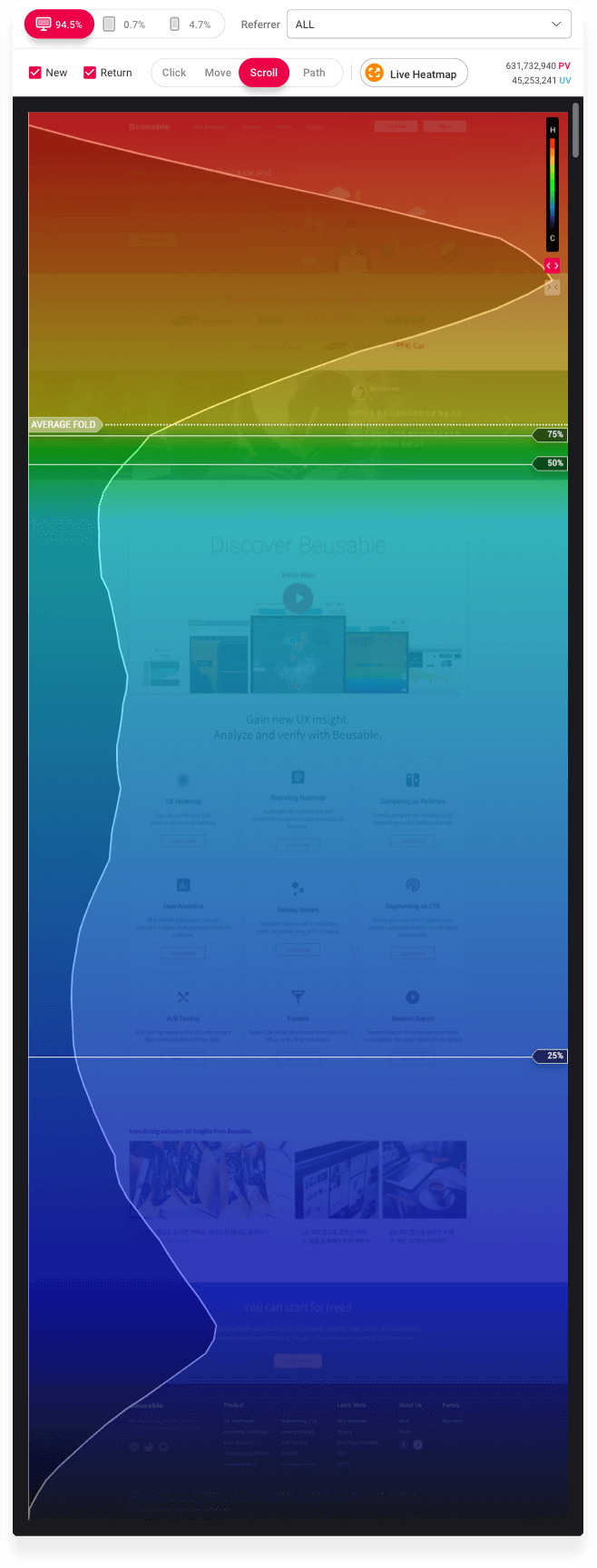
A Scroll Heatmap is exactly what it sounds like, it is a heatmap that shows how far down the screen users scroll.
Why should you care about this? Well, Beusable will show you the average screen height of your users’ devices (called the ‘fold’), from this you can see if users have explored your site further than the initial screen that is shown to them.
Do you have important information that is not visible to users beyond the fold?
Are users scrolling up and down the screen looking for information?
Do you have text-heavy pages that aren’t being read all the way through?
Are there products that your users are not seeing because they are not scrolling down your e-commerce site enough?
These are questions that can be answered using the Scroll Heatmap that cannot be answered in a user interview.

Attention Graph
The photo above shows the Scroll Heatmap, but it also shows the Attention Graph. The zig-zagging white line shows where the users are focusing their attention, and when you hover over a section it will tell you the average time a user spends on that area.
This feature is especially cool because other analytical tools tend to only show how long a user spends on a general page/screen, but not specifically where on that screen/what piece of content.
Why should you care about this? By understanding what your audience is focusing on (or not focusing on), you can determine where to put CTAs (call to actions), how to structure the hierarchy, as well as generally understand what aspects of your website users are and are not attracted to.
Path Plots


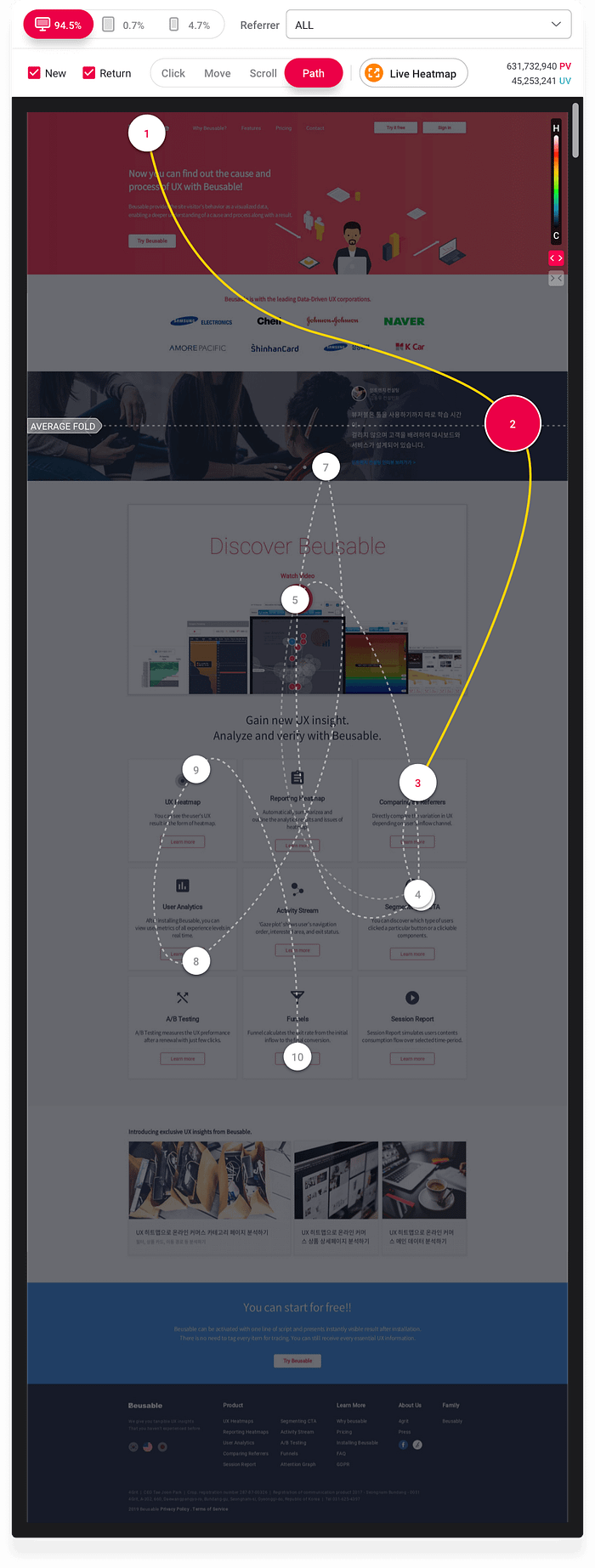
Path Plots show how users navigate through the screen.
As you can see in the photos, the data visualization is extremely easy to understand. More importantly, this is easy to EXPLAIN to others.
The screenshot of your site with the Path Plot overlay shows the average in-page journey of the user. This information can help you determine what content is key in increasing conversions (when someone takes a desired action on your site i.e. clicking a button).
This data alone is important, but you can get even more value out of this by filtering/comparing by referrer as well as new vs returning users.
By seeing how different user groups interact with your website, you better can determine how to structure and organize your content.
Even more information can be derived from the Path Plot Activity Statistics.
In the photo, you can see that there are two groups: the average group and the FANs.
The FANs are users that are in the top 25% activity range. Their Path Plots can help you determine what content can potentially convert users into purchasers, subscribers, etc.
Another piece of useful information is the Navigation Flow. Being able to understand EXACTLY how users interact with the screen (sequence, content, type/action, and duration) is not only valuable information for you to know as the designer, but it is simple for stakeholders to understand when you are defending your design decisions.
Live Heatmap
You may be wondering, “You already talked about heatmaps… why are we talking about them again?” Because heatmaps are awesome.
But seriously, the difference between the Live Heatmap and the Scroll Heatmap is that the Scroll Heatmap is a screenshot while the Live Heatmap allows you to interact with the site and open dynamic elements (i.e. carousels or hamburger menus).

There are also more search methods in the Live Heatmap. You can see what elements were clicked or tapped, what elements were hovered over, what percentage of hidden elements were exposed, and what percentage of those exposed elements were actually consumed by the users.
By using the Live Heatmap, you can determine what content your users are interested in and are consuming. You can restructure, add or remove, or completely overhaul content on your site to better fit your audience’s needs.
Why does any of this matter?
When you are conducting a case study, joining a new team, or doing freelance work, you need to understand users quickly. The research portion of the design process can be lengthy, but it is imperative for an effective design.
User interviews are great, but they take a lot of time and there is often a very small sample size. You also don’t always get accurate information, as users may find it difficult to interact with a website naturally while being evaluated.
A tool like Beusable offers designers the ability to simply plug in a line of code to the website, then let them take care of the rest. While you conduct other research, reports are being compiled for you (in as quickly as 2 hours). You can simply download the information for easy documentation and explanation.
Ultimately, it makes your job easier and offers you information that you otherwise would not have likely found through other methods of user research (at least not as easily or as well-presented).
Final Thoughts
My honest opinion of Beusable is that it is a fantastic tool that I will be using in the future for case studies, as well as recommending to any businesses that I may do freelance work for (to make my job easier).
If you found this article helpful and are interested in trying Beusable, they are offering a one-month free trial of their Basic Plan for those who use my referral link.
